Here’s a quick look at how I get from point A to point B with a branding/logo project. The process involves getting a lot of ideas onto paper before choosing and refining the best ones. My weapon of choice for some more refined drawings is a dotted sketchbook.
Initial Sketches
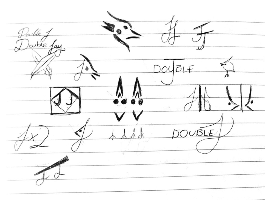
For any logo project the best way to get the best design is to put as many ideas on paper as possible. I thought I would play on how “J” when spoken can also mean “Jay”, the bird.
For the most part, the chosen logos played with a mirror effect. These were all cleaned up and then evaluated. I showed these to as many people as possible to get constructive feedback and a general reaction.
Refined Sketches
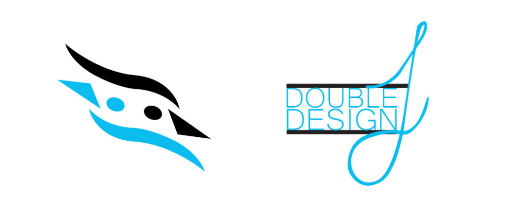
These were the chosen logos. The decision was made based mostly on the feedback received. The slightly more abstract “double jay” logo was the most effective and required no additional explanation or description.