Here you will find a collection of complete projects, works in progress and other odds and ends. My work ranges from animation/videos to websites/back-end development to illustrations/front-end development. Feel free to relax and scroll away or click on one of the buttons below to filter the pieces by type.
This project is currently in progress. I am working on converting these protoypes into a Wordpress theme. This website needed an upgrade that showcased my client's talent for both writing and photography. From the old site to the new I updated the colour palette and layout for a cleaner look as well as easier navigation and access to content for users.
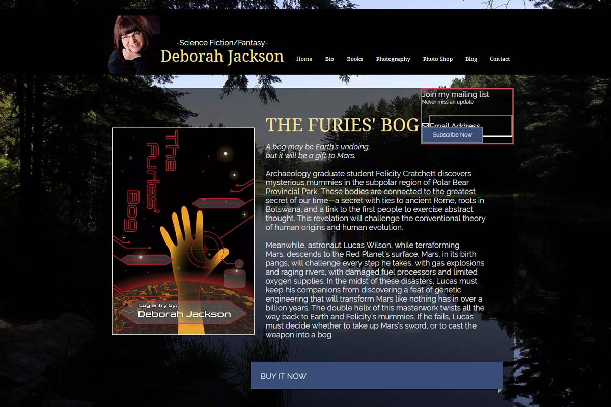
Homepage / Before
Here is a quick peek at what the site homepage looked like before.
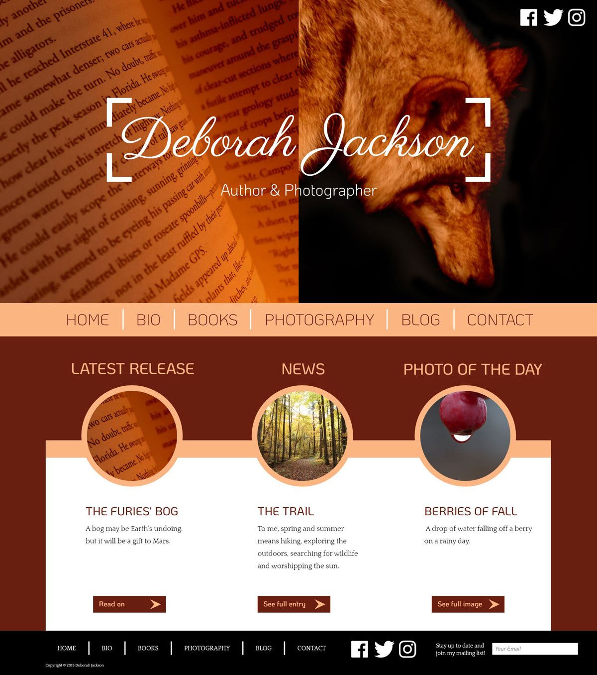
Homepage / After
This is the revised homepage. I opted to go for a more minimalistic approach. The colour palette is neutral but rich, best fit for an author/photographer who writes for nearly everyone (kids, teens and adults). These are colours that can cater to all types of bookworms who may visit the site. Not too bight an playful for the adults and not too dull for the kids.
I stripped the homepage of most of its content and only displayed the logo on top of some stunning images related to what the author/photographer does. The nav would be displayed on the bottom of the logo image combo to ensure that the user can quickly navigate to whichever page they need to. The mini update section below the nav is meant to provide the user with quick access to the most up to date content on the site. I kept the mailing list section, but put it in the footer, so it could be consistent and displayed across all pages.
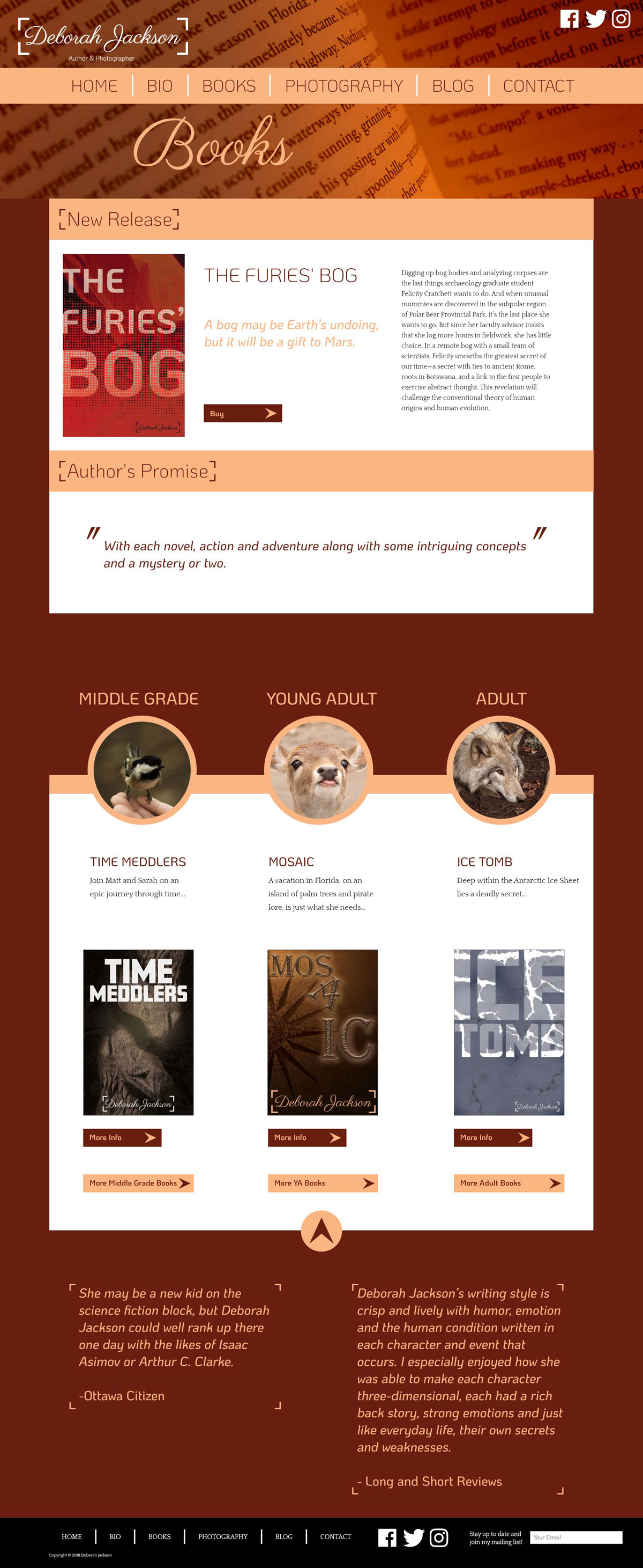
Books Page
The books page has been made more of a navigation page where the user could navigate to sub pages with books more related to their age or interest. The only thing that is allotted a large space for more content is the “latest release.” This is for the author to better advertise her latest book and guide the users to take a look there first.
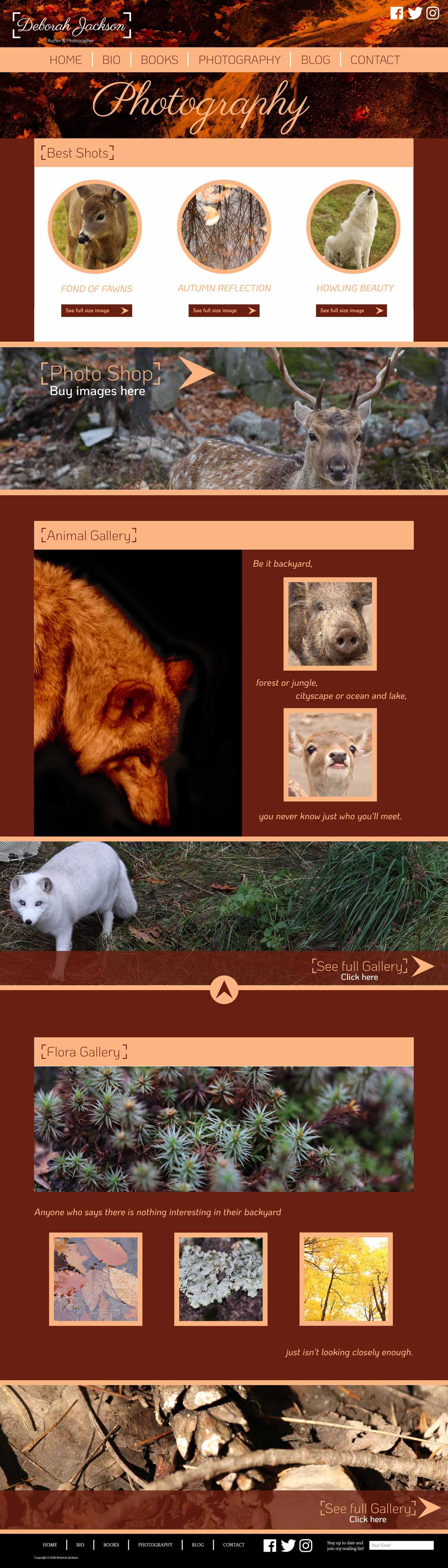
Photography Page
The photography page posed a great challenge: how to display a bunch of great photography while making sure the pictures don’t fight with each other? I chose much fewer photos to put on display in favour of having larger galleries on subpages by category. The “photo shop” has also been moved to the photography page to minimize confusion and a more pleasant user experience.
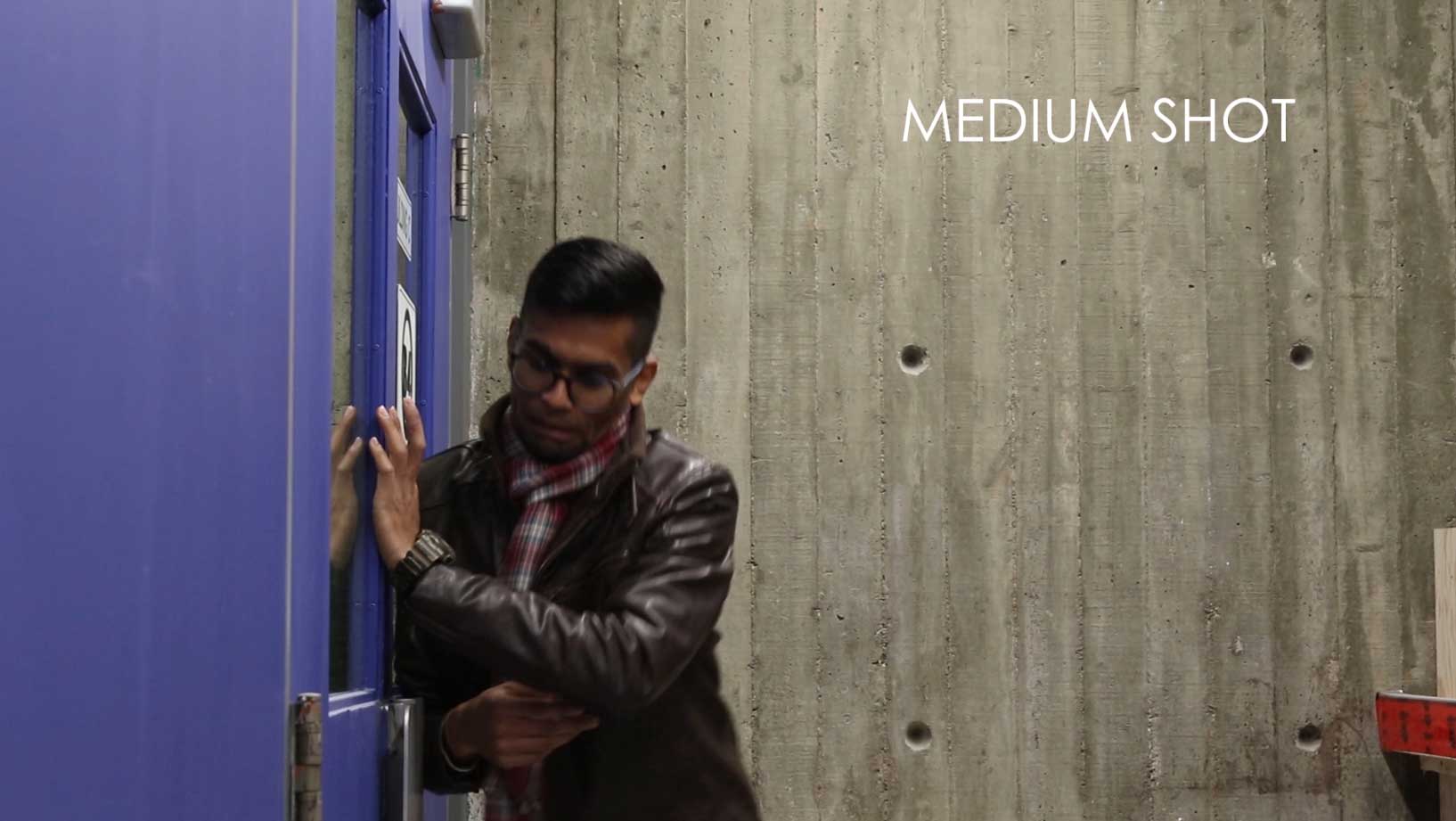
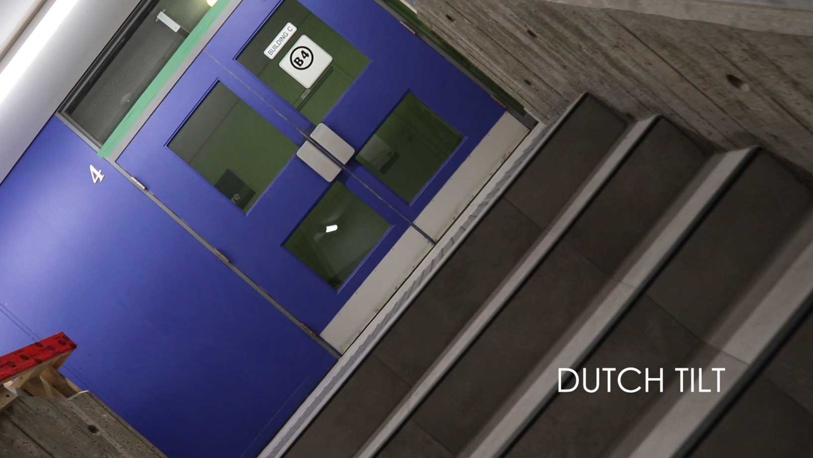
The Door
October 2018
Storytelling with a twist. This was a project where our directing, storytelling and knowlege of different types of cinematographic shots were put to the test.
Medium Shot Example
One of the requirements on the project was to identify each of the shot types with a text element.
Dutch Tilt Example
I opted to play off trailers for horror films in my intro for comedic effect.
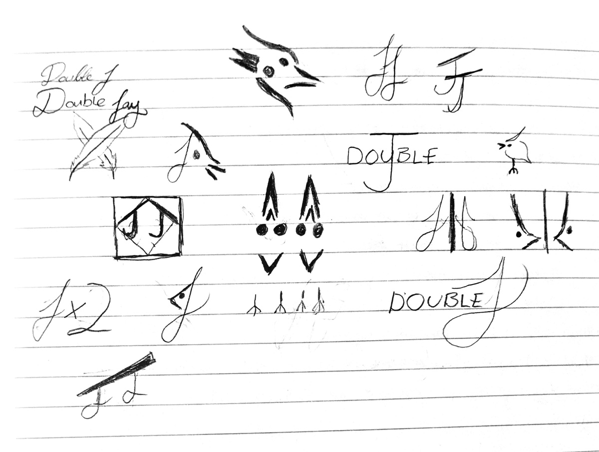
Double J Design Logo
October 2018
Here's a quick look at how I get from point A to point B with a branding/logo project. The process involves getting a lot of ideas onto paper before choosing and refining the best ones. My weapon of choice for some more refined drawings is a dotted sketchbook.
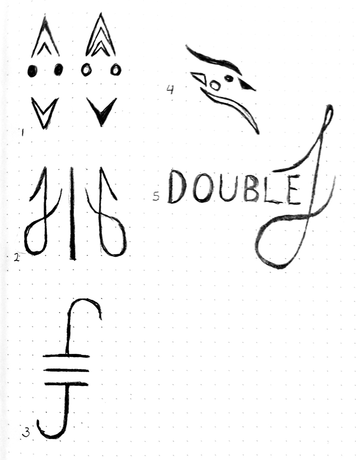
Rough Ideas
For any logo project the best way to get the best design is to put as many ideas on paper as possible. I thought I would play on how "J" when spoken can also mean "Jay", the bird.
Refined Ideas
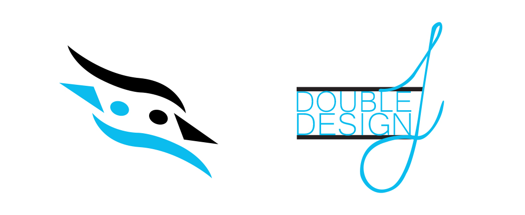
For the most part, the chosen logos played with a mirror effect. These were all cleaned up and then evaluated. I showed these to as many people as possible to get constuctive feeback and a general reaction.
Selected Logos
These were the chosen logos. The decision was made based mostly on the feedback received. The slightly more abstract "double jay" logo was the most effective and required no additional explanation or description.
A Photographic Study of Lighting
October-November 2018
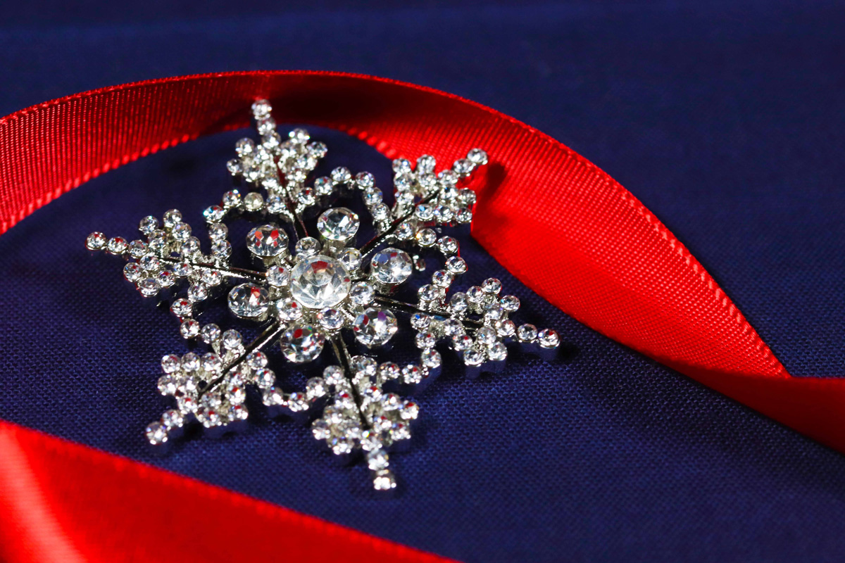
Lighting is probably one of the most challenging and important aspects of photography. This series of photos is all about lighting. The challenge is getting the right lighting in a fully controlled environment or working with what is immediately available.
Snowflake
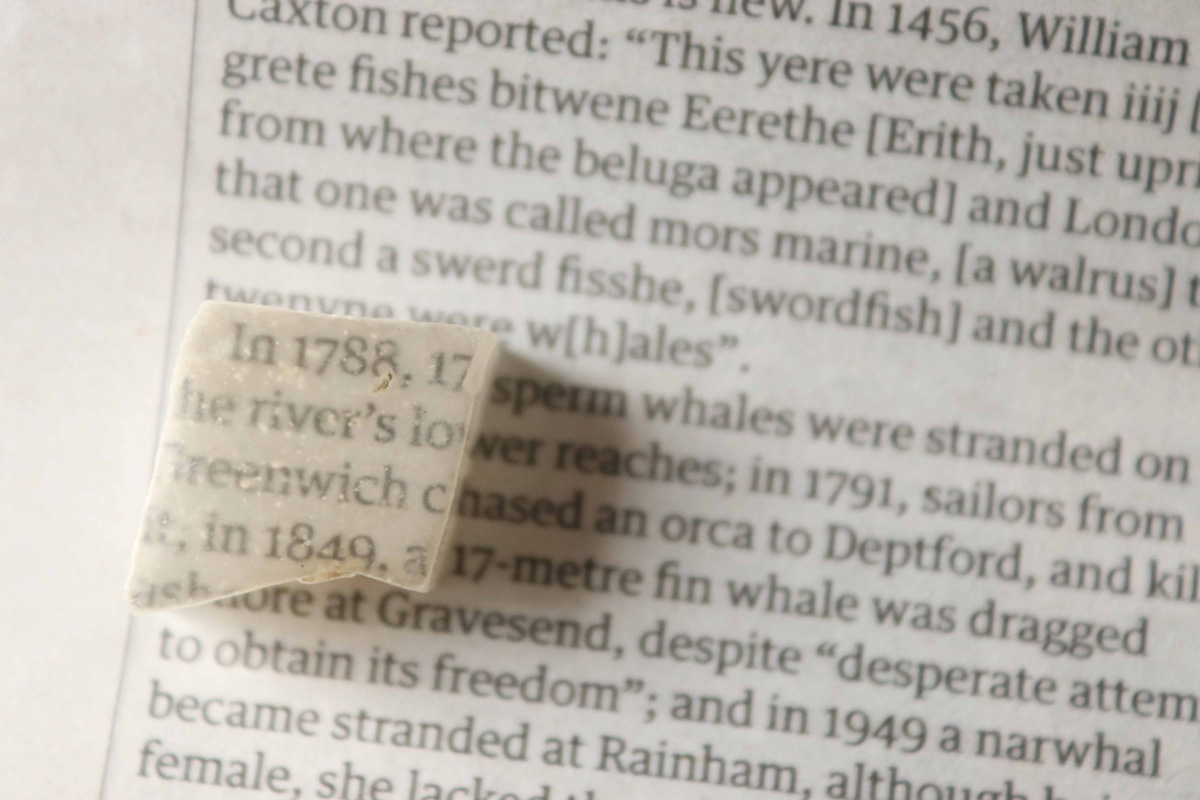
TV Stone
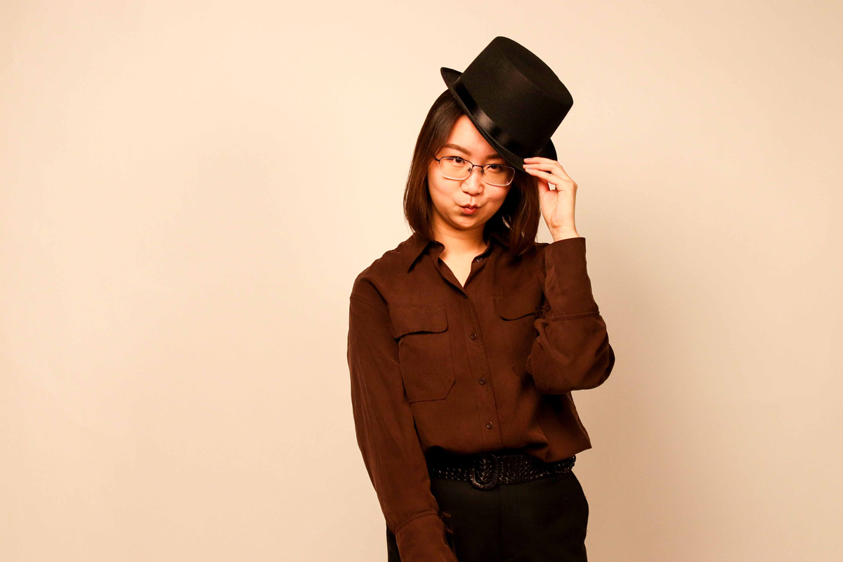
Portrait
One of my favourites from a photo session in the studio for Kayleen Wu.
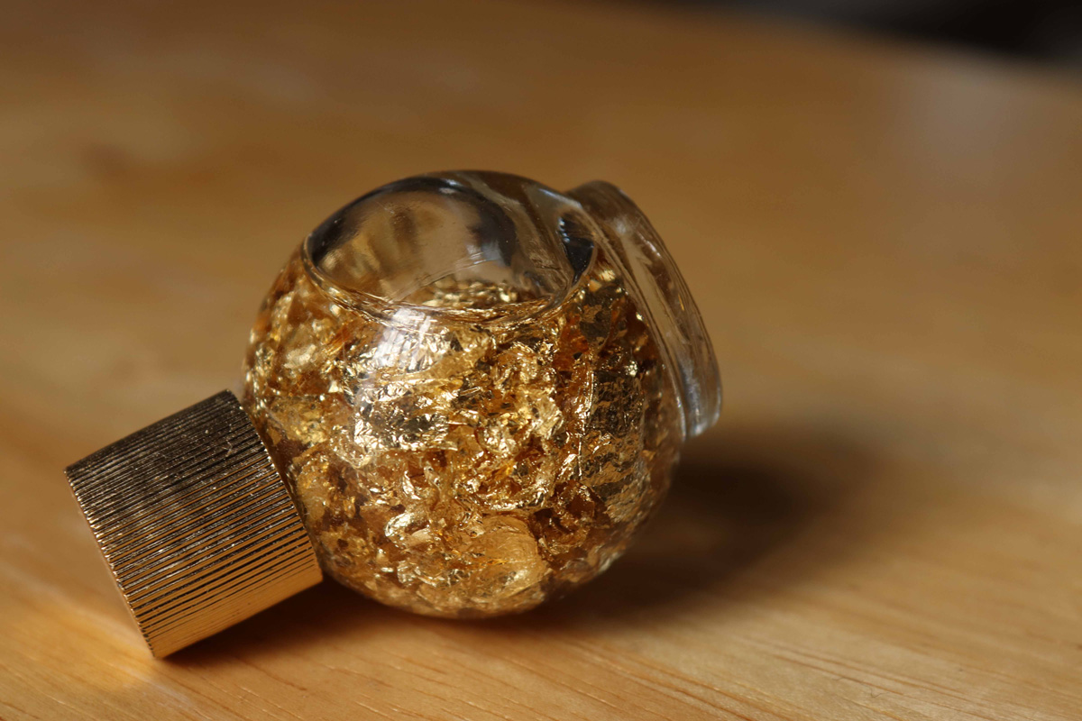
Gold in a Bottle
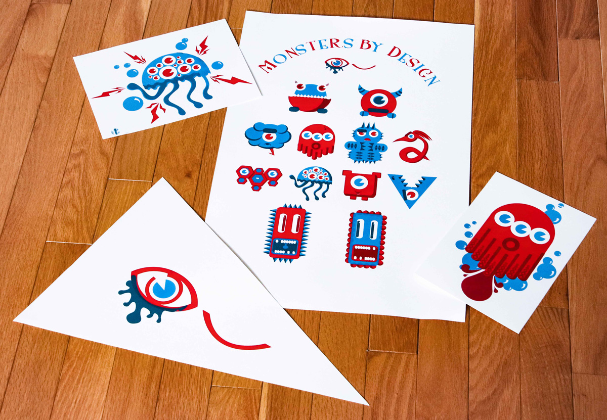
Monsters by Design
March 2014
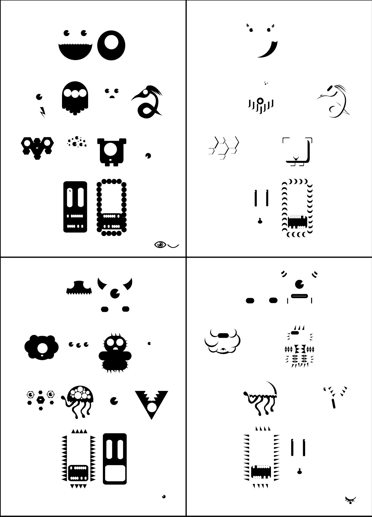
This is a project I worked on as part of a two-woman team. Our intent for this project was to immerse ourselves in creation. We decided to imagine a bunch of little monsters that work as a unified whole and then brand the little critters. We started by making a poster in a digital environment and then transferred it to paper via silkscreen. We took the project a step further by also silk-screening the little monsters onto t-shirts and stickers.
Poster Sections for Silkscreen
All these different sections were necessary to silkscreen the final poster with the correct colours.
Top Left: Fill red
Top Right: Dark red
Bottom Left: Fill blue
Bottom Right: Dark blue
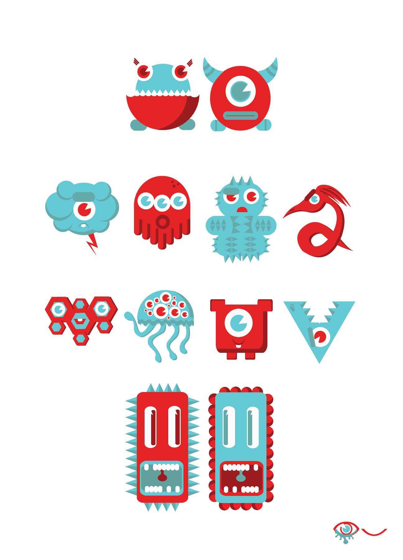
Full Poster
This was the final digital version of the poster.
Final Prints
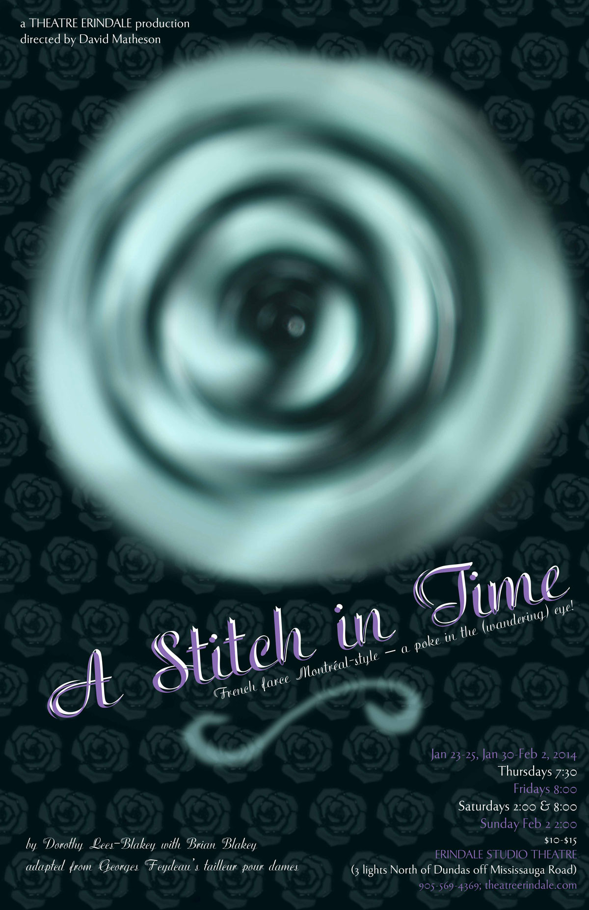
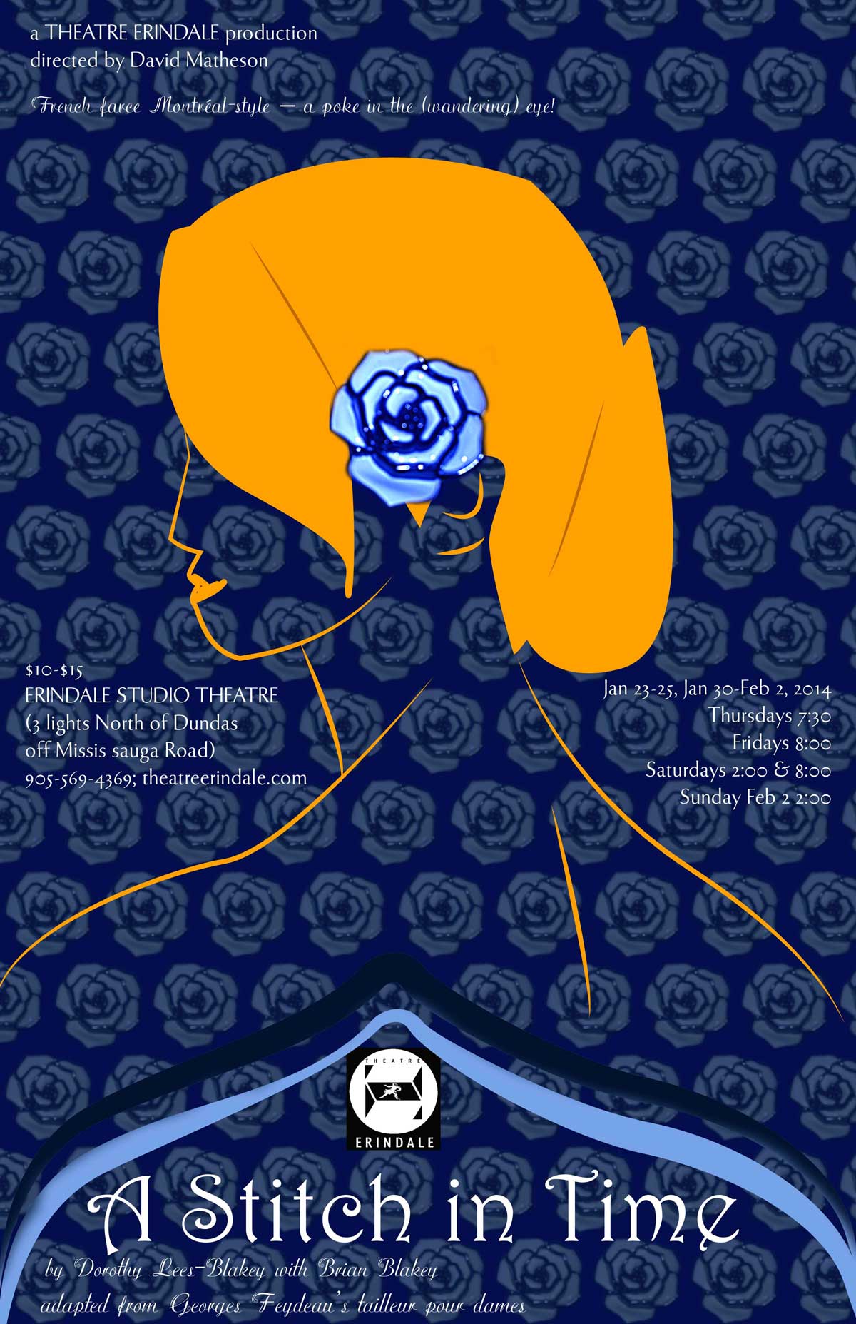
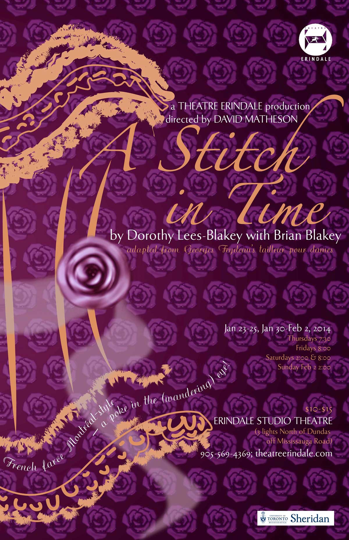
A Stitch in Time
December 2014
This poster was a contest winner and made for a production of A Stitch in Time. My classmates and I all submitted a poster and the winner was chosen by the play director. The additional challenge was that we were meant to base our poster off a single object. In my case, that object was the flower hairclip.
ASIT Poster version 1
This was the first of three versions of the poster. Although it was eye-catching it did not really relate to the play much at all. In the end I decided that this was the weakest of the three.
ASIT Poster version 2
This particular version was not as interesting or eye-catching as the first one but was less abstract.
ASIT Poster Final
The third and final poster was deemed relevant, interesting and the best of all three versions. This is the one that won the contest and was ultimately used to advertise the play.
Rideau Gymnastics Video Outro
March 2019
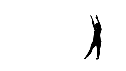
I worked as Project Lead & Graphic Designer for a team that was responsible for creating some call to action videos for Rideau Gymnastics. My part involved creating an outro that could be used in all four videos that we had done. I wanted to have the silhouette of a gymnast turn into part of the Rideau Gymnastics logo
Full Outro
This was the final version of the outro.
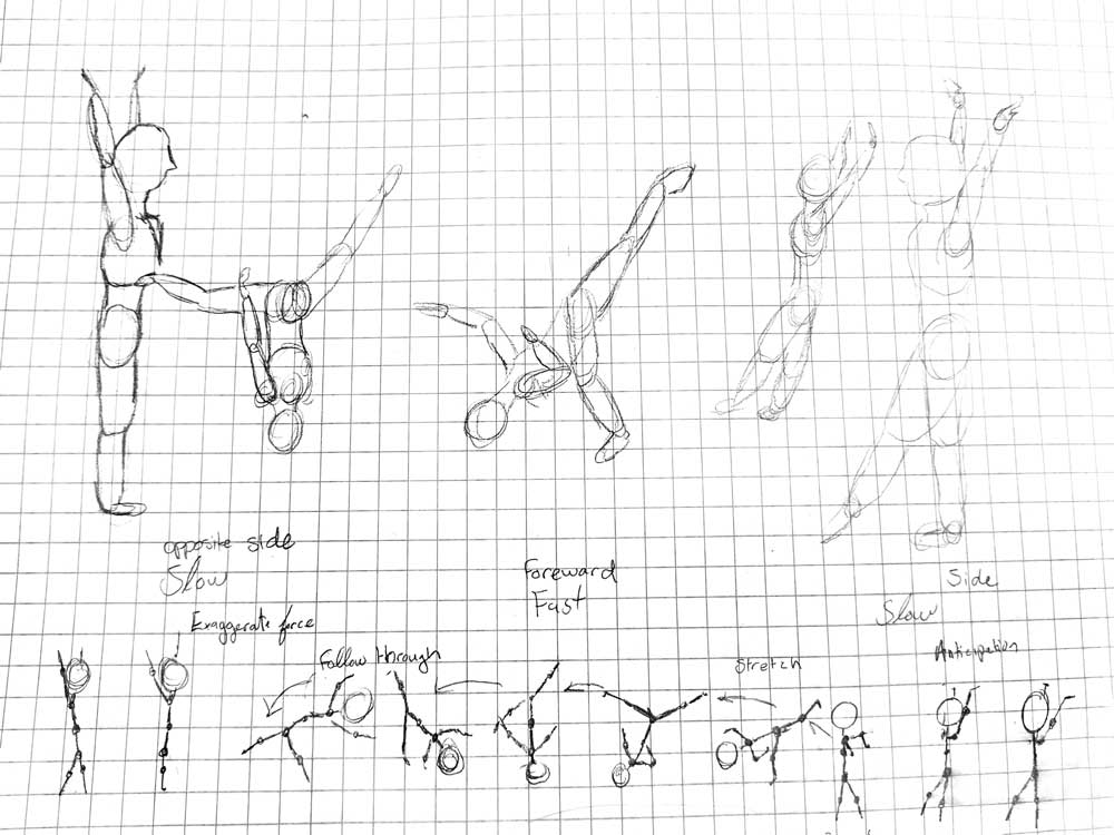
Aerial Cartwheel Study
To animate this properly I watched and sketched gymnasts doing aerial cartwheels. This is one example of the many sketches I had worked on before going on to animate it.
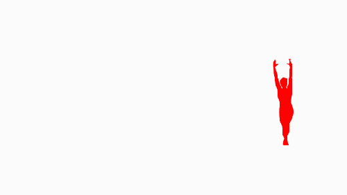
Morph Test
Before getting to animating I wanted to test the morping portion of the idea to see how smooth I could make the animation.
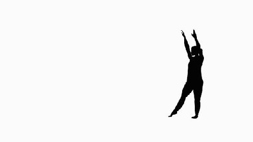
Aerial Cartwheel Animation
This was the final version of the animation before the rest of the logo was included.
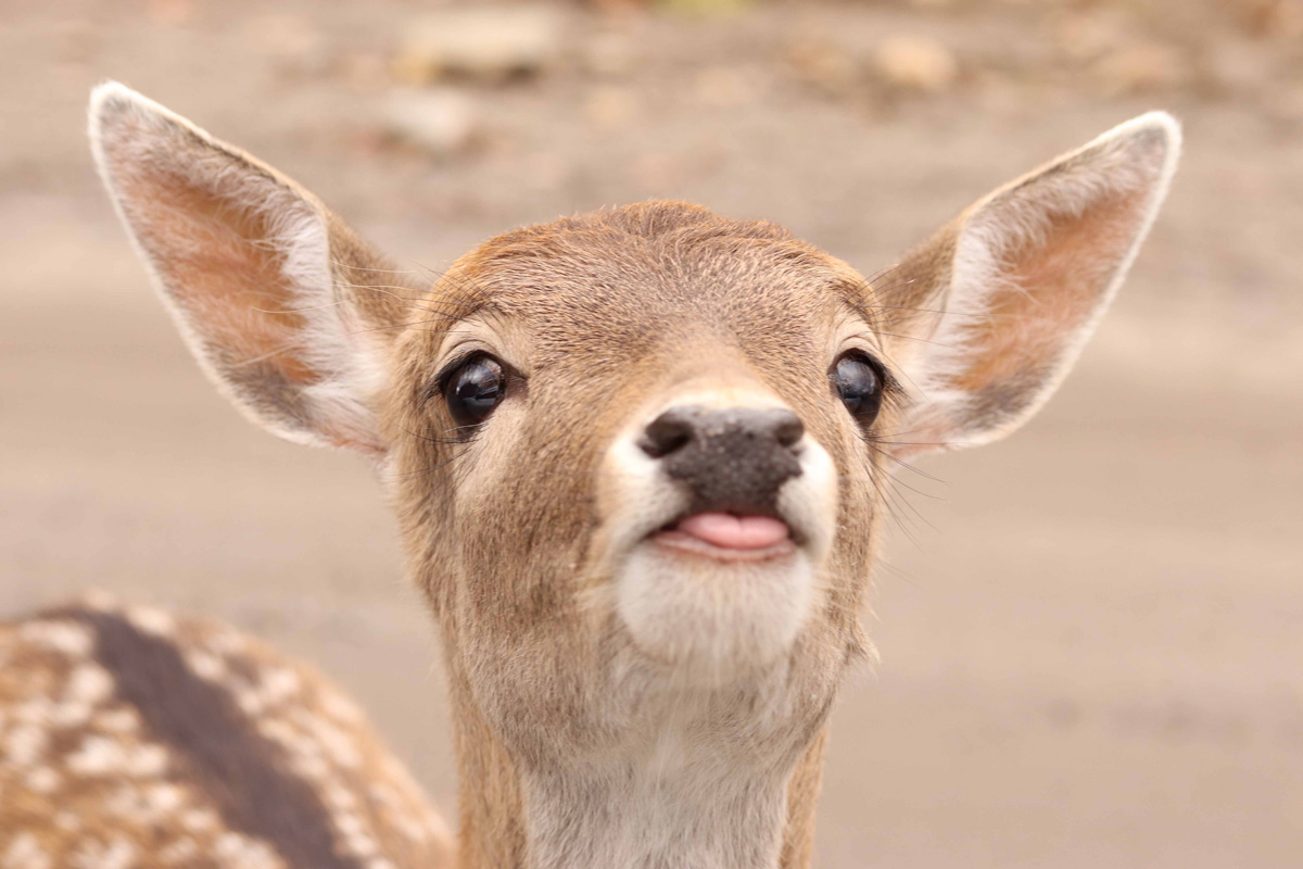
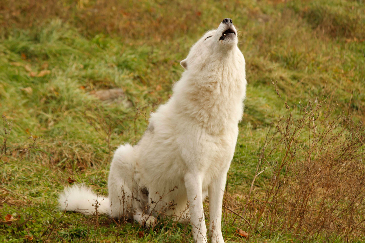
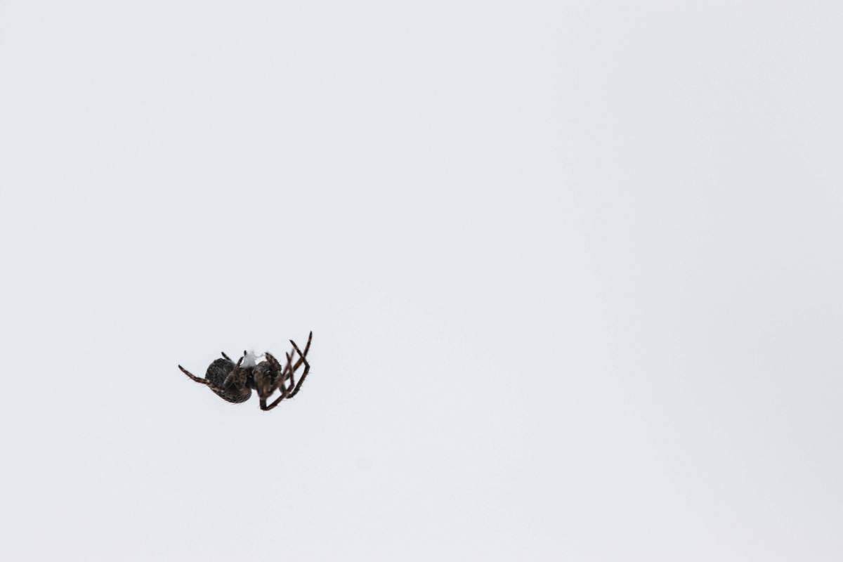
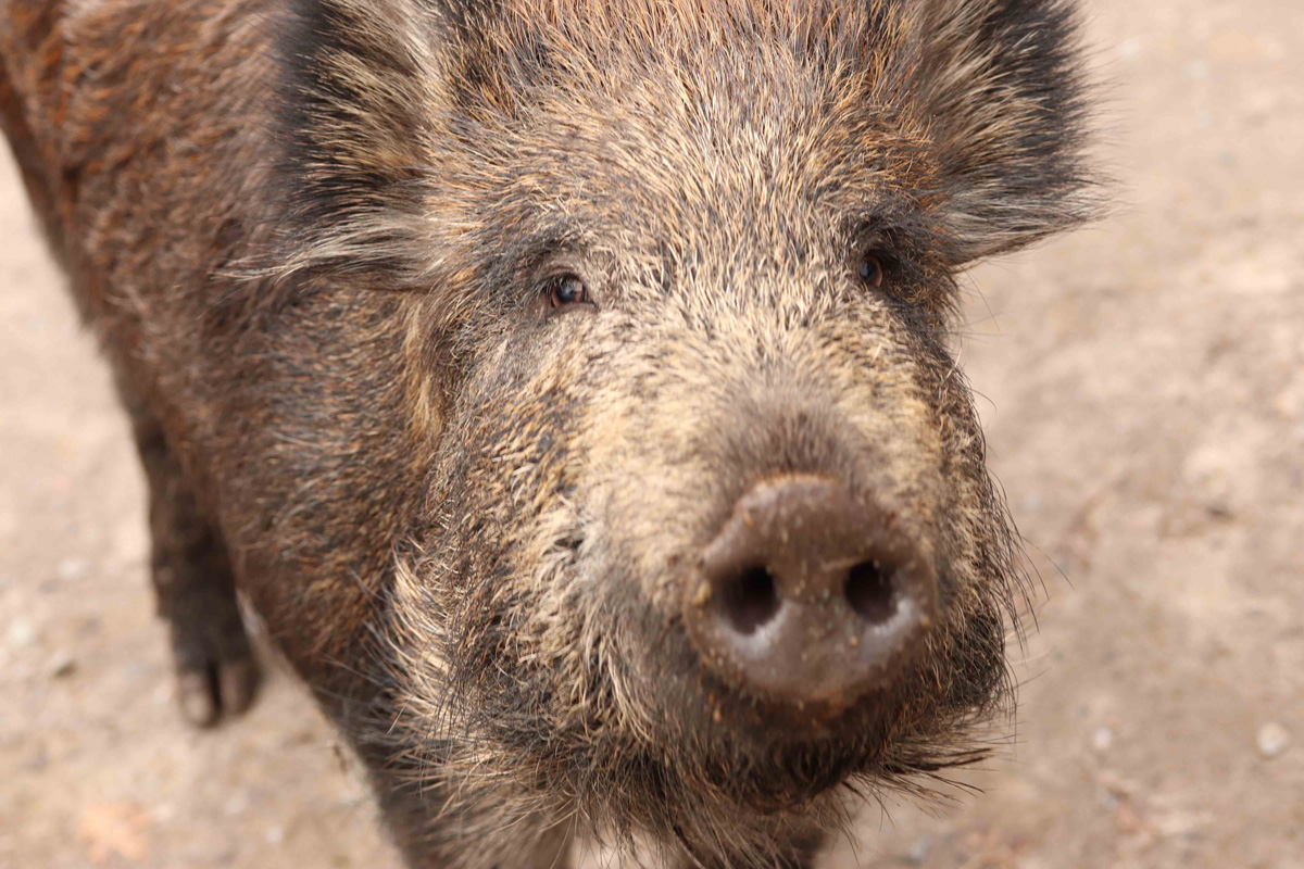
A Photographic Study of Animals
Out in the woods taking pictures of the local wildlife patience and reaction time are key. My favourite photographic subject is nature and animals are the most difficult and rewarding things to capture on film.
Deer
White Wolf
Winter Spider
Pig
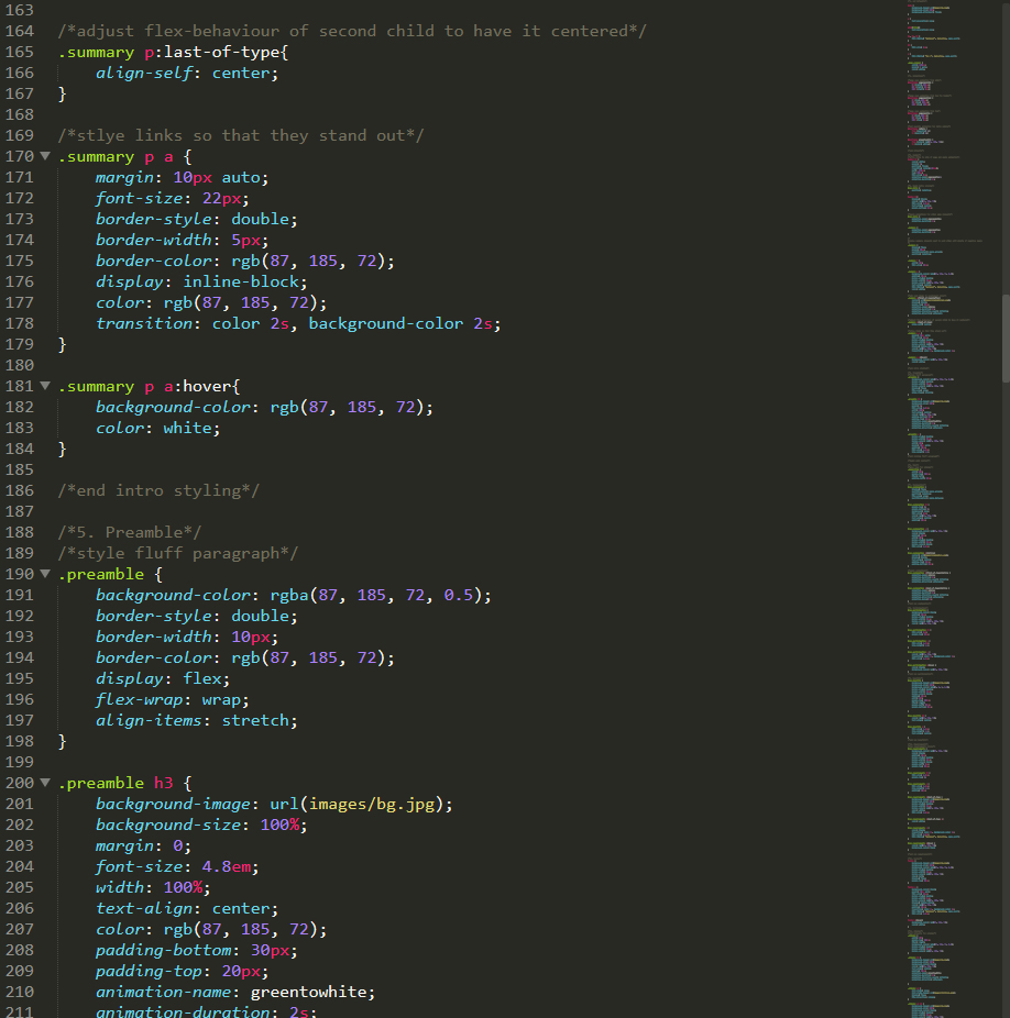
CSS Zen Garden
October 2018
This is a project based solely on coding in CSS. We are provided with the HTML content and we have to come up with a design and use only CSS to make it work. I challenged myself to stick to only one colour and two images to create this design.
Full Page
Example CSS Code
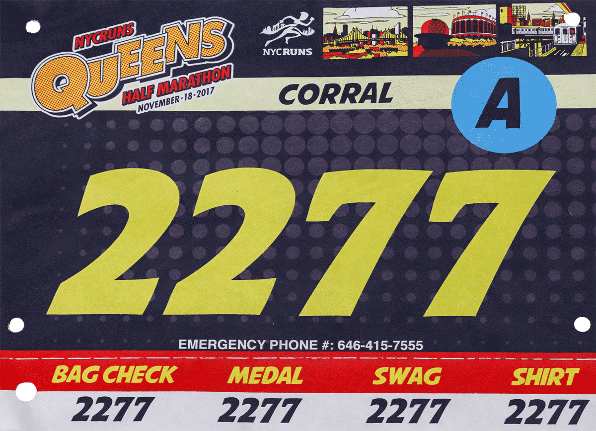
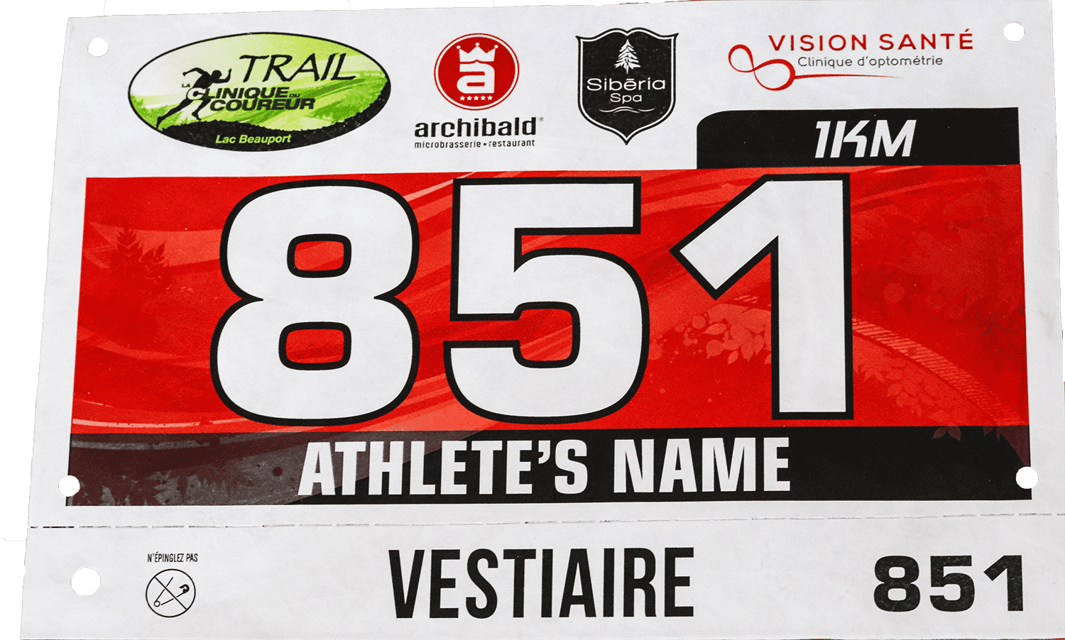
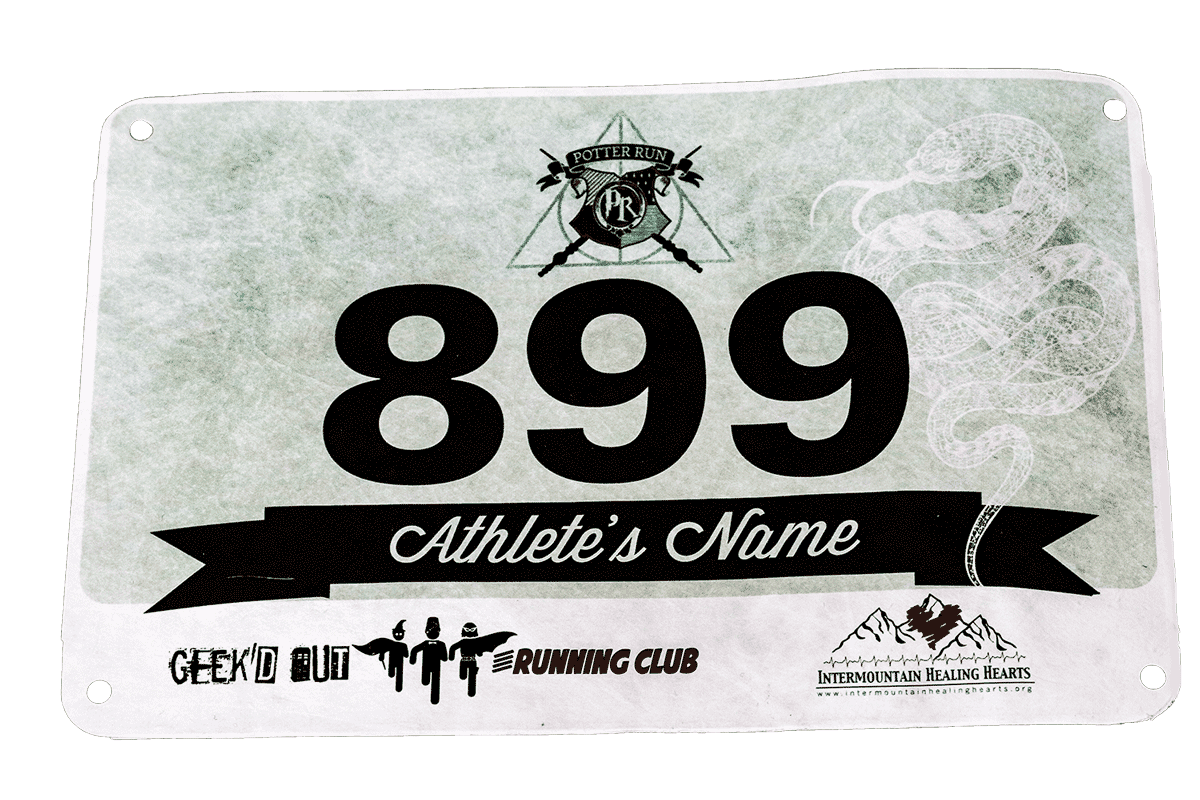
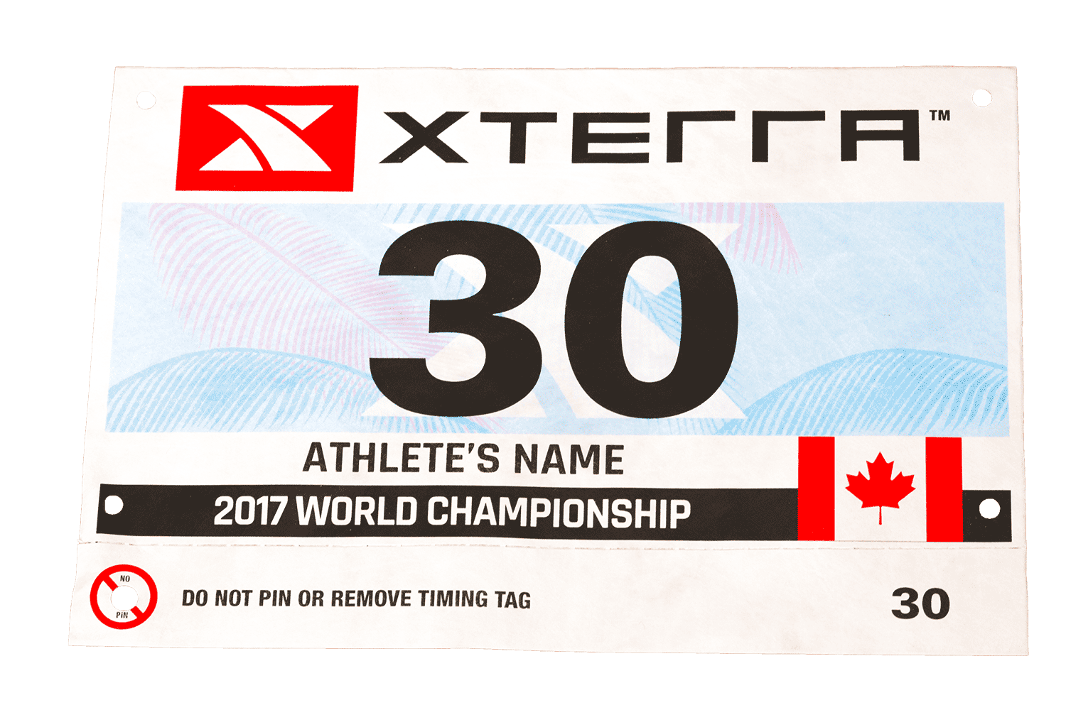
From BibNumbers.com
2017-2018
While working for Bibnumbers.com I had the opportunity to work with many directors for both small and large events. I created most of the designs on the bibs for NYC Runs and XTERRA throughout 2017 and 2018.
Queens Marathon
Trail la clinique du coureur
Potter Run
XTERRA World Championship
How to Make a Mask
November 2018
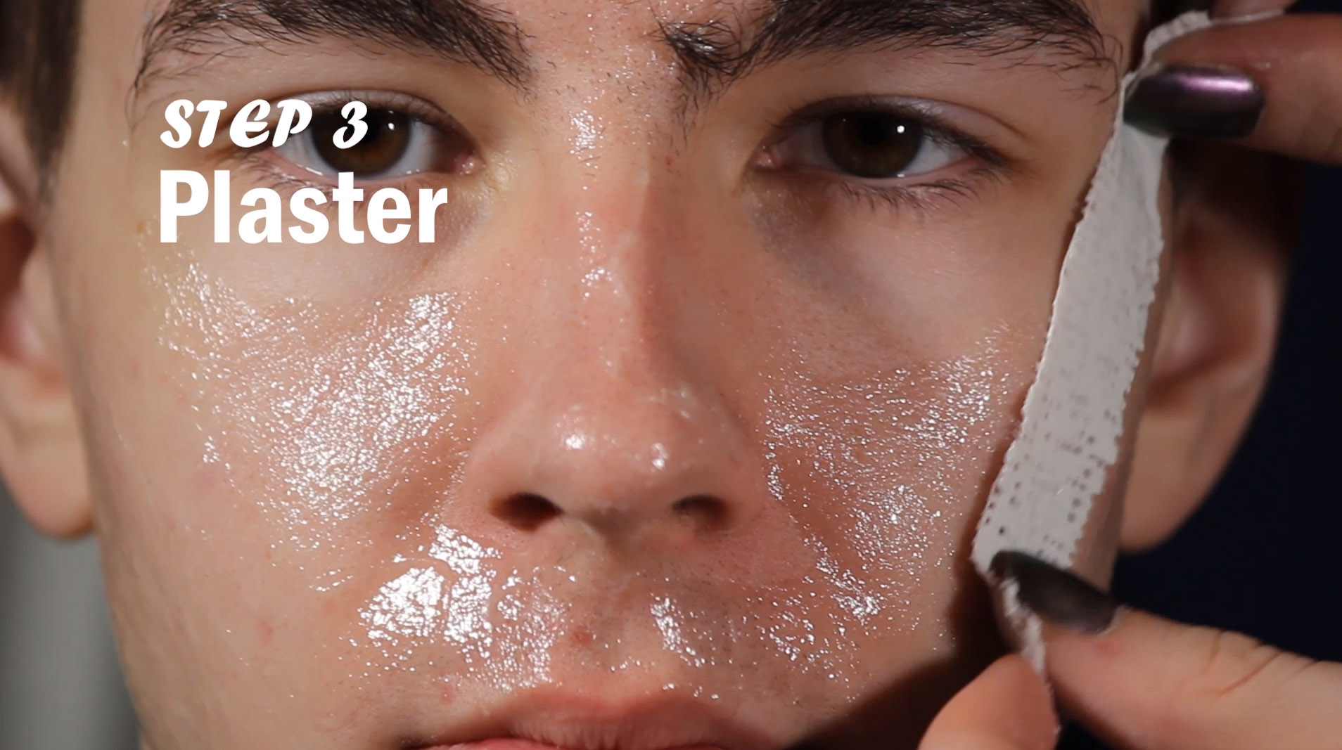
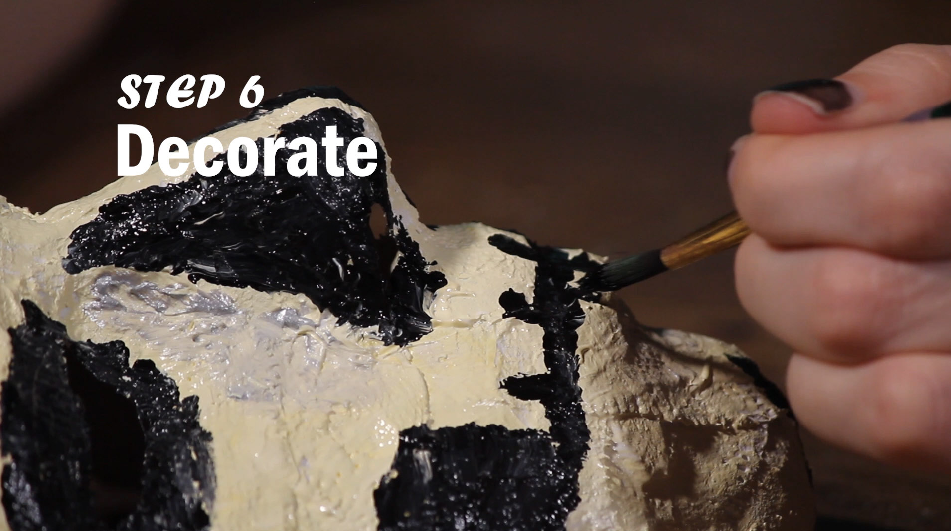
To hone my videography skills I created a "how to" video. I enjoy creating costumes and mask making is a huge part of that. I had to set up multiple cameras to make this work because I only really had one mask and one opportunity to get the recordings I needed.
How To Make a Mask Full Video
How To Still 1
How To Still 2
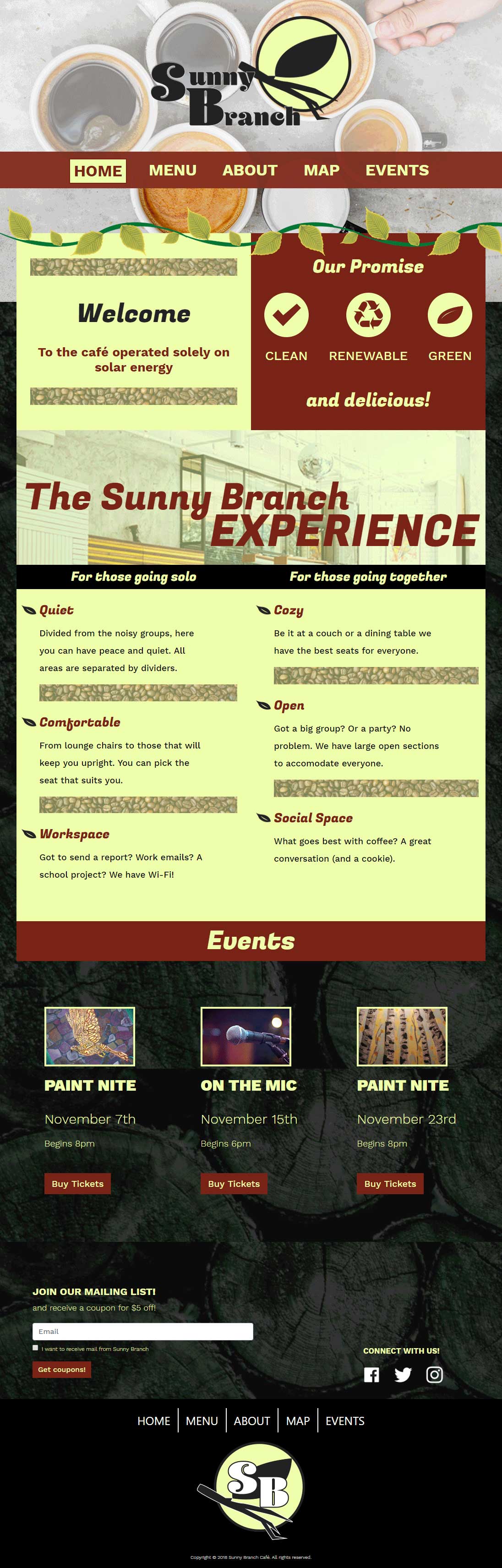
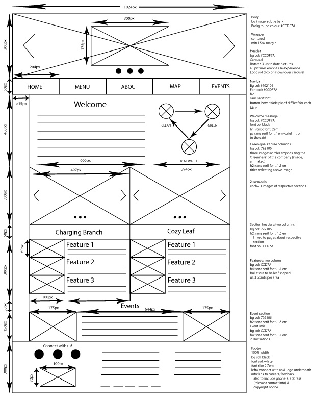
Sunny Branch Cafe
December 2018
This is a website created for an imagined cafe. This project went from wireframes to prototypes to being hard coded. I utilized Bootstrap to support the final responsive layout.
Home Page
There was a lot of information to fit on the front page. I sought to make that information easy to read and not too daunting to look at.
Home Page Wireframe
This was the first draft of the wireframe for the home page.