


These protoypes are meant to be converted into a WordPress theme. This website needed an upgrade that showcased my client’s talent for both writing and photography. The header was changed to a cover and the remainder of the site became more muted to emphasize the content with minimal distraction. From the old site to the new I updated the colour palette and layout for a cleaner look as well as easier navigation and access to content for users.
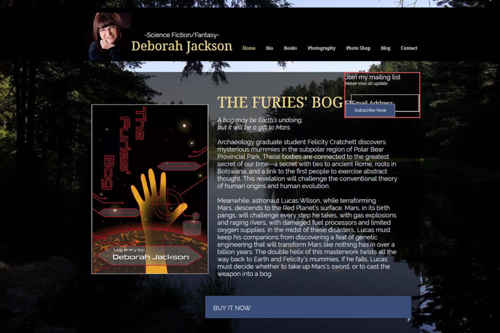
See the old site below.
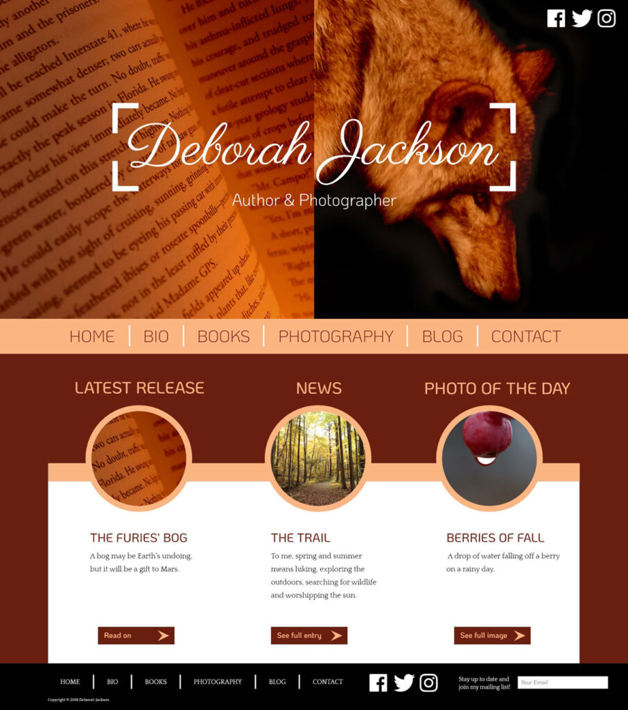
I stripped the homepage of most of its content and only displayed the logo on top of some stunning images related to what the author/photographer does. The nav would be displayed on the bottom of the logo image combo to ensure that the user can quickly navigate to whichever page they need to. The mini update section below the nav is meant to provide the user with quick access to the most up to date content on the site. I kept the mailing list section, but put it in the footer, so it could be consistent and displayed across all pages.
I created a new books and photo gallery page for the project as well.
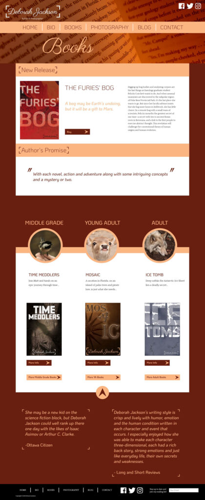
This would be the books page. The whole site mixes hard and soft edges. The latest release is meant to sit front and center while the bottom half acts as a mini store and navigation to collections of written books.
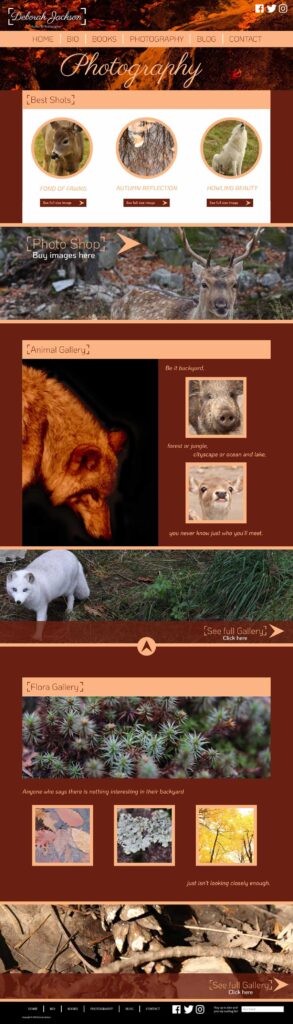
The photography page posed a great challenge: how to display a bunch of great photography while making sure the pictures don’t fight with each other? I chose much fewer photos to put on display in favour of having larger galleries on sub-pages by category. The “photo shop” has also been moved to the photography page to minimize confusion and a more pleasant user experience.