
2019
Like many web designers and developers before me, I created my own version of the zen garden site. The original can be found here. This was my introduction to intense CSS use.
This is a project based solely on coding in CSS. We are provided with the HTML content and we have to come up with a design and use only CSS to make it work. I challenged myself to stick to only one colour and two images to create this design.
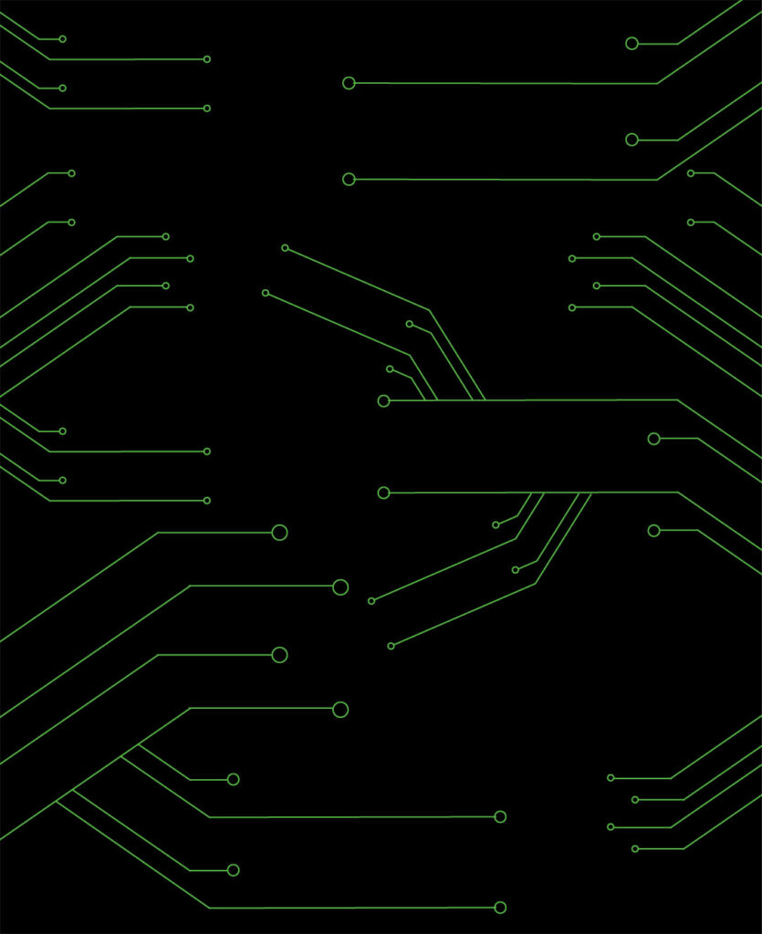

So with the colour green as well as the background image seen here and the sphere, I came up with the design below.
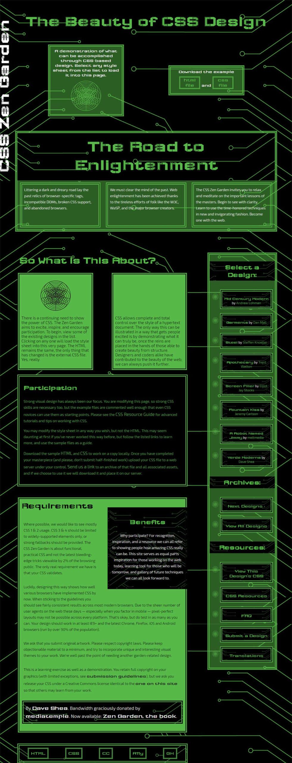


Below is the CSS that makes up this style. Note that is is only made to be viewed at the desktop level.
@import url('https://fonts.googleapis.com/css?family=Exo+2:300|Wallpoet');

/*Contents*/

/*1. Set defaults*/
/*2. set animations*/
/*3. Header (title of whole page)*/
/*4. Intro*/
/*5. Preamble*/
/*6. Main content*/
/*7. Explanation*/
/*8. Participation*/
/*9. Benefits*/
/*10. Requirements*/
/*11. Footer*/
/*12. Sidebar*/

/*1. set defaults*/

body {
	background-image: url(images/bg.jpg);
	background-size: 100%;
	background-attachment: fixed;
}

a {
	text-decoration: none;
}

abbr[title]{
	text-decoration: none;
}

h1, h2, h3 {
	font-family: 'Wallpoet', helvetica, sans-serif;
}

h3 {
	font-size: 2em;
}

p {
	font-family: 'Exo 2', helvetica, sans-serif;
}

.page-wrapper {
	width: 1250px;
	margin: 0 auto;
	color: white;
}

/*2. Animations*/

/*page open animation from side*/
@keyframes pageopenside {
	0% {right:-500px;}
	80% {right: 50px;}
	100% {right: 0px;}
}

/*page open animation from top for header*/
@keyframes pageopentop2 {
	0% {top:-500px;}
	80% {top: 550px;}
	100% {top: 450px;}
}

/*page open animation from top*/
@keyframes pageopentop {
	0% {top:-500px;}
	80% {top: 50px;}
	100% {top: 0px;}
}

/*set opacity animation for intro sphere*/
@keyframes sphere {
	from {opacity: 1;}
	to {opacity: 0;}
}

@keyframes greentowhite {
	from {color: rgb(87, 185, 72);}
	to {color: white;}
}

/*end defaults*/

/*3. Header*/
/*affix title to side of page and apply animation*/
header h1 {
	color: white;
	margin: 0;
	position: fixed;
	transform: rotate(-90deg);
	left: -375px;
	top: 450px;
	font-size: 5em;
	animation-name: pageopentop2;
	animation-duration: 2s;
}

/*4. Begin intro styling*/
#zen-intro {
	position: relative;
}

header h2{
	display: block;
	color: rgb(87, 185, 72);
	font-size: 4.5em;
	text-align: center;
	margin-bottom: 20px;
}

/*Apply animations for other page elements*/
#zen-intro {
	animation-name: pageopenside;
	animation-duration: 2s;
}

.summary {
	animation-name: pageopentop;
	animation-duration: 2s;
}

/*
Display summary elements next to each other with plenty of negative space
*/
.summary {
	display: flex;
	margin: 50px;
	justify-content: space-around;
	position: relative;
}

.summary * {
	width: 28%;
	font-size: 20px;
}

.summary p {
	background-color: rgba(87, 185, 72, 0.5);
	padding: 10px;
	border-style: double;
	border-width: 10px;
	border-color: rgb(87, 185, 72);
	text-align: center;
	font-family: 'Wallpoet', helvetica, sans-serif;
	color: white;
}

/*add cool image to supplement style*/
.summary p:first-of-type::after{
	content: url(images/scanspheregr.png);
	display: block;
	margin-top: 15px;
	animation-name: sphere;
	animation-duration: 4s;
	animation-iteration-count: infinite;
	animation-direction: alternate
}

/*adjust flex-behaviour of second child to have it centered*/
.summary p:last-of-type{
	align-self: center;
}

/*stlye links so that they stand out*/
.summary p a {
	margin: 10px auto;
	font-size: 22px;
	border-style: double;
	border-width: 5px;
	border-color: rgb(87, 185, 72);
	display: inline-block;
	color: rgb(87, 185, 72);
	transition: color 2s, background-color 2s;
}

.summary p a:hover{
	background-color: rgb(87, 185, 72);
	color: white;
}

/*end intro styling*/

/*5. Preamble*/
/*style fluff paragraph*/
.preamble {
	background-color: rgba(87, 185, 72, 0.5);
	border-style: double;
	border-width: 10px;
	border-color: rgb(87, 185, 72);
	display: flex;
	flex-wrap: wrap;
	align-items: stretch;
}

.preamble h3 {
	background-image: url(images/bg.jpg);
	background-size: 100%;
	margin: 0;
	font-size: 4.8em;
	width: 100%;
	text-align: center;
	color: rgb(87, 185, 72);
	padding-bottom: 30px;
	padding-top: 20px;
	animation-name: greentowhite;
	animation-duration: 2s;
	animation-iteration-count: infinite;
	animation-direction: alternate
}

.preamble p {
	border-style: double;
	border-width: 10px;
	border-color: rgb(87, 185, 72);
	width: 28%;
	margin: 10px auto;
	padding: 10px;
	font-size: 1.1em;
	line-height: 1.7;
}
/*end styling fluff paragraph*/

/*begin main content*/

/*6. Main*/
/*give room for sidebar*/
.supporting {
	width: 65%;
	margin-top: 100px;
	float: left;
	padding-left: 10px;
}

/*7. Explanation*/
#zen-explanation {
	display: flex;
	justify-content: space-around;
	position: relative;
	flex-wrap: wrap;
	justify-content: space-between;
}

#zen-explanation h3 {
	margin-top: 0;
	margin-bottom: 0;
	background: none;
	font-size: 3em;
	color: rgb(87, 185, 72);
	text-align: center;
	padding: 10px;
}


#zen-explanation p {
	background-color: rgb(87, 185, 72);
	color: black;
	padding: 10px;
	width: 40%;
	border-style: double;
	border-width: 10px;
	border-color: black;
	font-size: 1.2em;
}

#zen-explanation p::before{
	content: url(images/scansphere.png);
	display: block;
	text-align: center;
	padding-top: 20px;
	padding-bottom: 20px;
}

/*apply animations*/
#zen-explanation p:first-of-type::before {
	animation-name: sphere;
	animation-duration: 4s;
	animation-iteration-count: infinite;
	animation-direction: alternate;
}

#zen-explanation p:last-of-type::before {
	animation-name: sphere;
	animation-duration: 4s;
	animation-iteration-count: infinite;
	animation-direction: alternate;
	animation-delay: 4s;
}
/*end zen explanation*/

/*8. Participation*/
#zen-participation {
	background-color: black;
	padding: 20px;
	border-style: double;
	border-width: 10px;
	border-color: rgb(87, 185, 72);
	color: rgb(87, 185, 72);
}

#zen-participation h3 {
	font-size: 2em;
	margin-top: 15px;
}

#zen-participation p {
	font-size: 1.1em;
	line-height: 1.7;
}

#zen-participation a {
	color: rgb(87, 185, 72);
	transition: color 2s, background-color 2s;
	font-size: 1.2em;
}

#zen-participation a:hover {
	color: black;
	background-color: rgb(87, 185, 72);
}
/*end zen participation*/

/*9. Benefits*/
#zen-benefits {
	background-image: url(images/bg.jpg);
	background-size: 100%;
	background-color: rgba(0, 0, 0, 0.5);
	border-style: double;
	border-width: 10px;
	border-color: black;
	padding: 10px;
	width: 42%;
	margin-top: 100px;
	float: right;
	margin-left: 50px;
	margin-bottom: 50px;

}

#zen-benefits h3 {
	color: rgb(87, 185, 72);
	text-align: center;
}

#zen-benefits p {
	font-size: 1.1em;
	line-height: 1.7;
	text-align: center;

}
/*end zen benefits*/

/*10. Requirements*/
/*zen requirements styles*/
#zen-requirements {
	background-color: rgb(87, 185, 72);
	color: black;
	padding: 10px;
	border-style: double;
	border-width: 10px;
	border-color: black;
	margin-left: 0px;
	margin-top: 50px;
}

#zen-requirements h3 {
	font-size: 2.5em;
	margin-top: 0;
}

#zen-requirements p {
	font-size: 1.1em;
	line-height: 1.7;
	padding: 10px;
}

#zen-requirements p:last-of-type {
	background-image: url(images/bg.jpg);
	background-size: 100%;
	border-style: double;
	border-width: 10px;
	border-color: rgb(87, 185, 72);
	color: white;
	font-size: 1.4em;
}

#zen-requirements p:last-of-type a{
	color: white;
}

#zen-requirements a {
	color: black;
	transition: color 2s, background-color 2s;
	font-size: 1.2em;
	font-family: 'Wallpoet', helvetica, sans-serif;
}

#zen-requirements a:hover {
	color: rgb(87, 185, 72);
	background-color: black
}

/*end zen requirements*/

/*11. Footer*/
footer {
	background-image: url(images/bg.jpg);
	background-size: 100%;
	background-color: rgba(87, 185, 72, 0.5);
	border-style: double;
	border-width: 10px;
	border-color: rgb(87, 185, 72);
	clear: both;
	display: flex;
	margin-top: 50px;
}

footer a {
	background-color: black;
	margin: 10px auto;
	font-size: 22px;
	border-style: double;
	border-width: 5px;
	border-color: rgb(87, 185, 72);
	display: inline-block;
	color: rgb(87, 185, 72);
	padding: 10px;
	transition: color 2s, background-color 2s;
	font-family: 'Wallpoet', helvetica, sans-serif;
	font-size: 1.3em;
}

footer a:hover{
	background-color: rgb(87, 185, 72);
	color: white;
}

/*12. Sidebar*/
/*set defaults for sidebar*/
.sidebar {
	width: 25%;
	margin-top: 100px;
	float: right;
	background-color: rgba(87, 185, 72, 0.5);
	border-style: double;
	border-width: 10px;
	border-color: rgb(87, 185, 72);
}

.sidebar h3 {
	background-image: url(images/bg.jpg);
	background-size: 100%;
	background-color: black;
	color: rgb(87, 185, 72);
	text-align: center;
	padding: 10px;
	animation-name: greentowhite;
	animation-duration: 2s;
	animation-iteration-count: infinite;
	animation-direction: alternate

}

.sidebar ul {
	list-style: none;
	list-style-image: url(images/listicon.png);
	display: flex;
	flex-direction: column;
}

.sidebar ul li {
	background-image: url(images/bg.jpg);
	background-size: 100%;
	background-color: black;
	border-style: double;
	border-width: 10px;
	border-color: rgb(87, 185, 72);
	float: left;
	text-align: center;
	margin: 10px;
	padding: 10px;
}

.sidebar ul li a:hover {
	background-color: rgb(87, 185, 72);
	color: white;
}

.sidebar ul li a {
	color: rgb(87, 185, 72);
	transition: color 2s, background-color 2s;
}

/*Fix fonts for sidebar*/
.design-selection ul li {
	font-family: 'Exo 2', helvetica, sans-serif;
}

.design-name {
	font-family: 'Wallpoet', helvetica, sans-serif;
	font-size: 1.1em;
	color: white;
}

.design-archives a {
	font-family: 'Wallpoet', helvetica, sans-serif;
	font-size: 1.3em;
}

.zen-resources a {
	font-family: 'Wallpoet', helvetica, sans-serif;
	font-size: 1.3em;
}